Positioning
A rooftop retreat, not another café
Open air and green in the middle of the city is the difference, so the brand leads with it.
Brand strategy, identity and environmental design for a rooftop café-lounge above Hyderabad. Relax. Refresh. Repeat.
The brief
Life is hectic. Palm Tree Cafe wanted to be the pause in the middle of it - an open rooftop lounge in Hyderabad with comfort food, good coffee, wines and beers.
From a hot latte to a perfectly cooked plate and a spicy cocktail, everything rests on freshness and an easy, unhurried evening with friends and family. The café needed a brand to say that, from the first coffee cup to the bus-stop poster.
There was a catch: the rooftop sits at the top of a commercial building. Guests had to find it and then climb a plain staircase before the escape began. So we redesigned the climb too.
So come, relax, refresh and repeat.
01 · Brand strategy
We boiled the experience down to a rhythm guests could feel and repeat. It became the tagline, the logo's outer ring and the first sign people read on the stairs.

A green escape from the everyday hustle: open sky, soft grass and warm light under cabanas.
Freshness wherever possible, from a hot latte and comfort food to cold beer and spicy cocktails.
A place that feels like yours, so you come back with friends and family again and again.
Positioning
Open air and green in the middle of the city is the difference, so the brand leads with it.
Audience
Friends after work, families at the weekend, anyone looking for an unhurried evening.
Personality
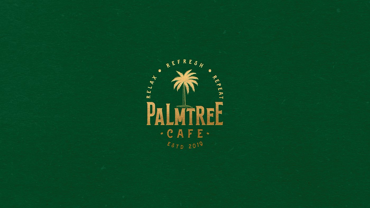
Vintage type, a gold-on-green seal and chalk-drawn details that feel made by hand.
02 · Brand identity
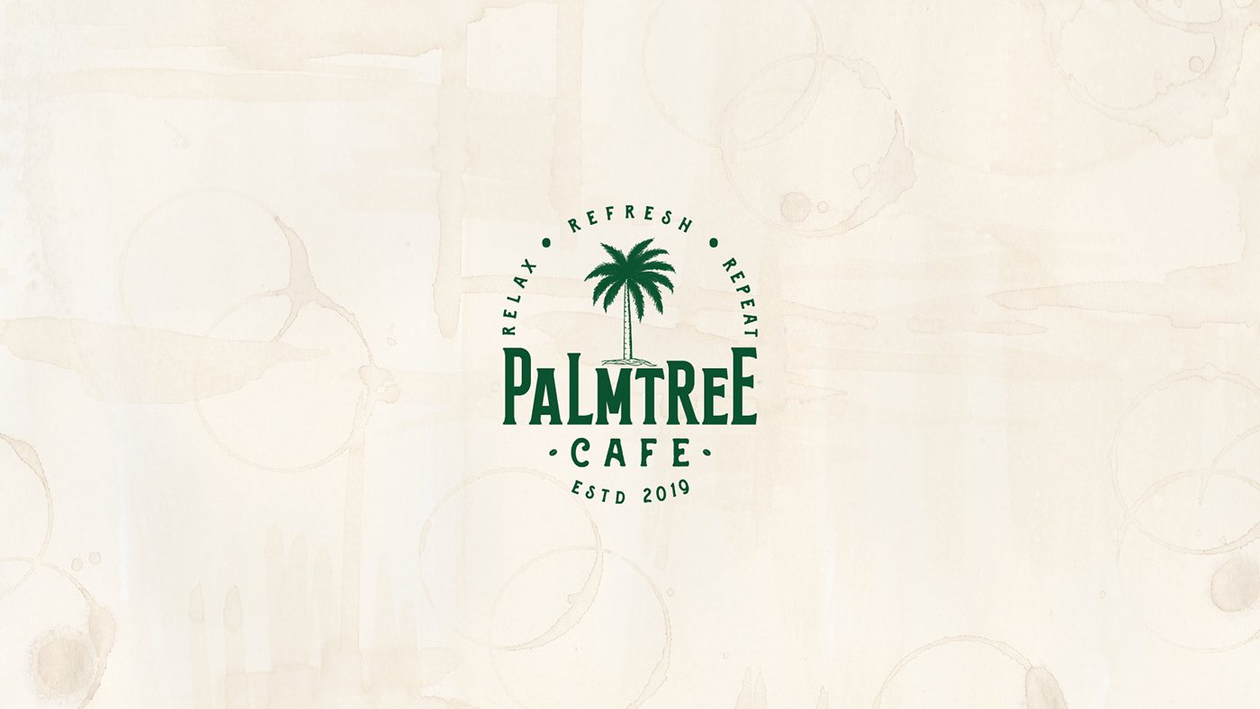
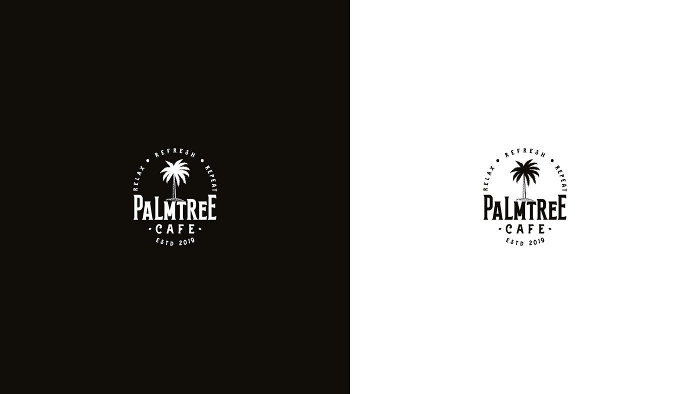
The palm is the escape. Around it, the promise - Relax · Refresh · Repeat - runs like the edge of a stamp.
PALMTREE sits in a condensed vintage display face with a playful lowercase “a”, and the date makes it a house seal. Scroll to watch it go from construction lines to outline to gold.
Identity system
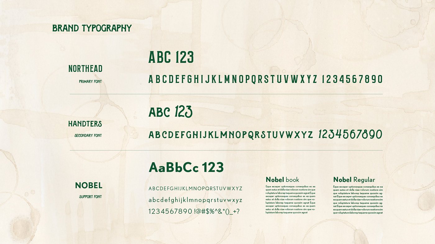
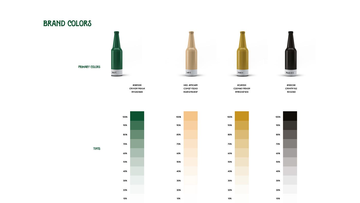
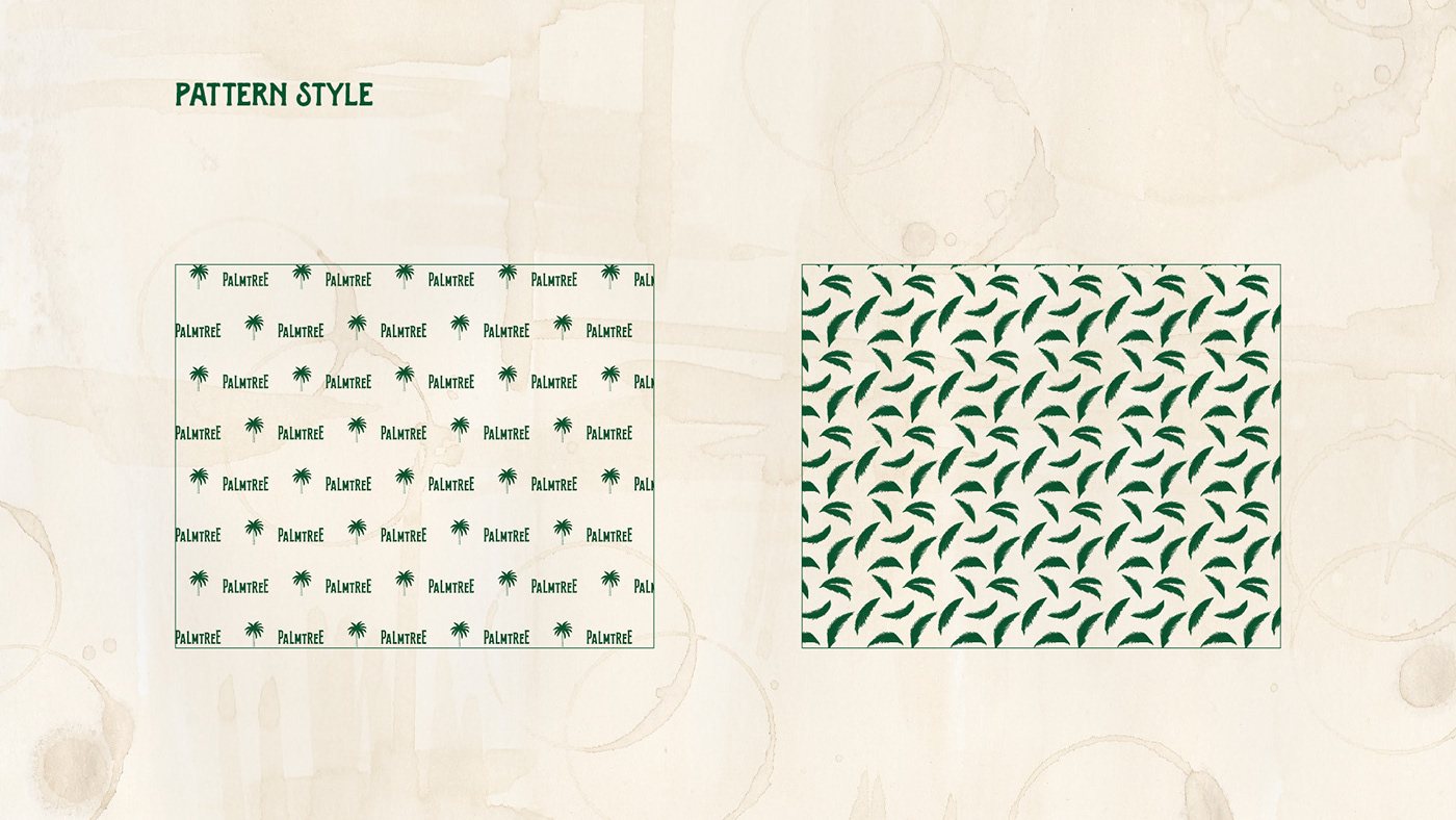
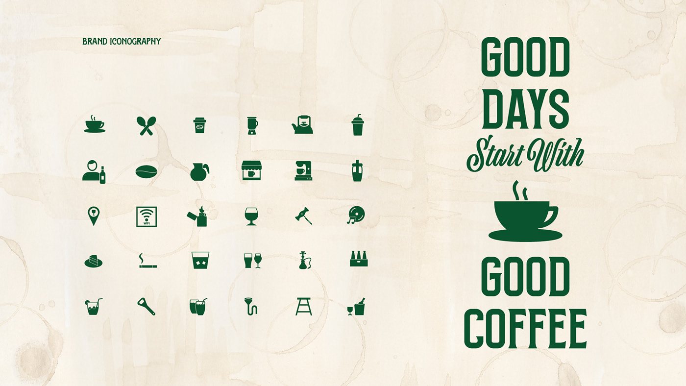
A deep palm green carries the brand. Sand and gold bring the warmth of evening light; black keeps it grounded. Northead leads, Handters adds a hand-lettered accent, Nobel does the reading.
03 · Applications
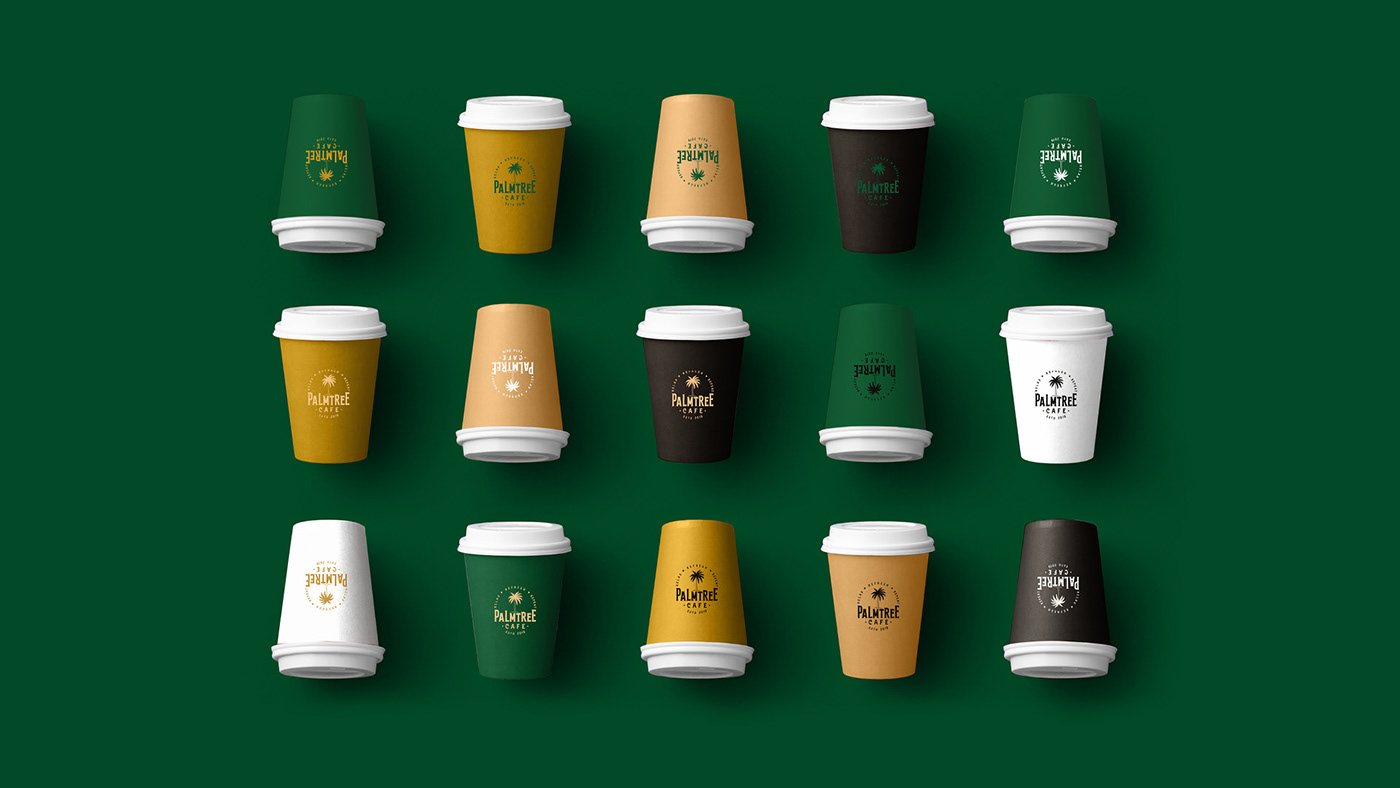
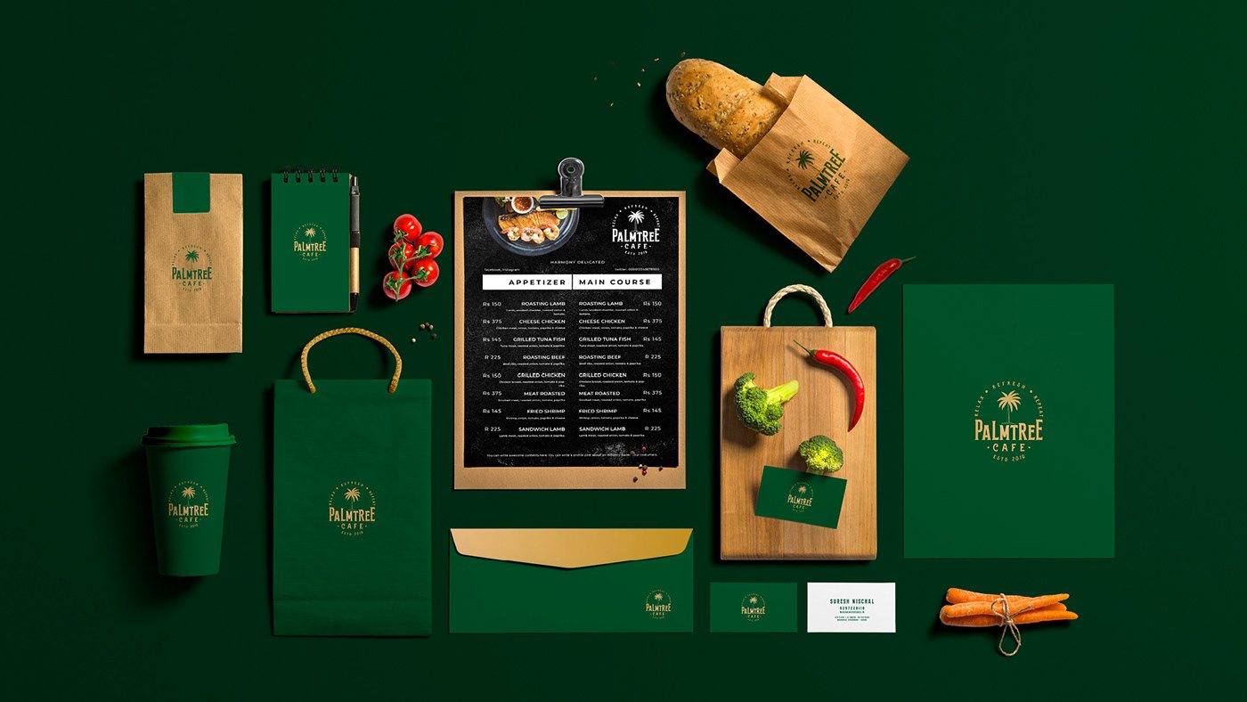
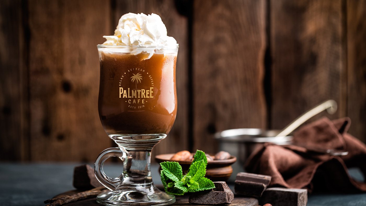
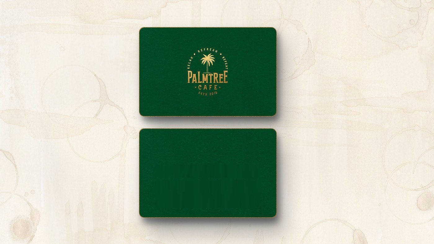
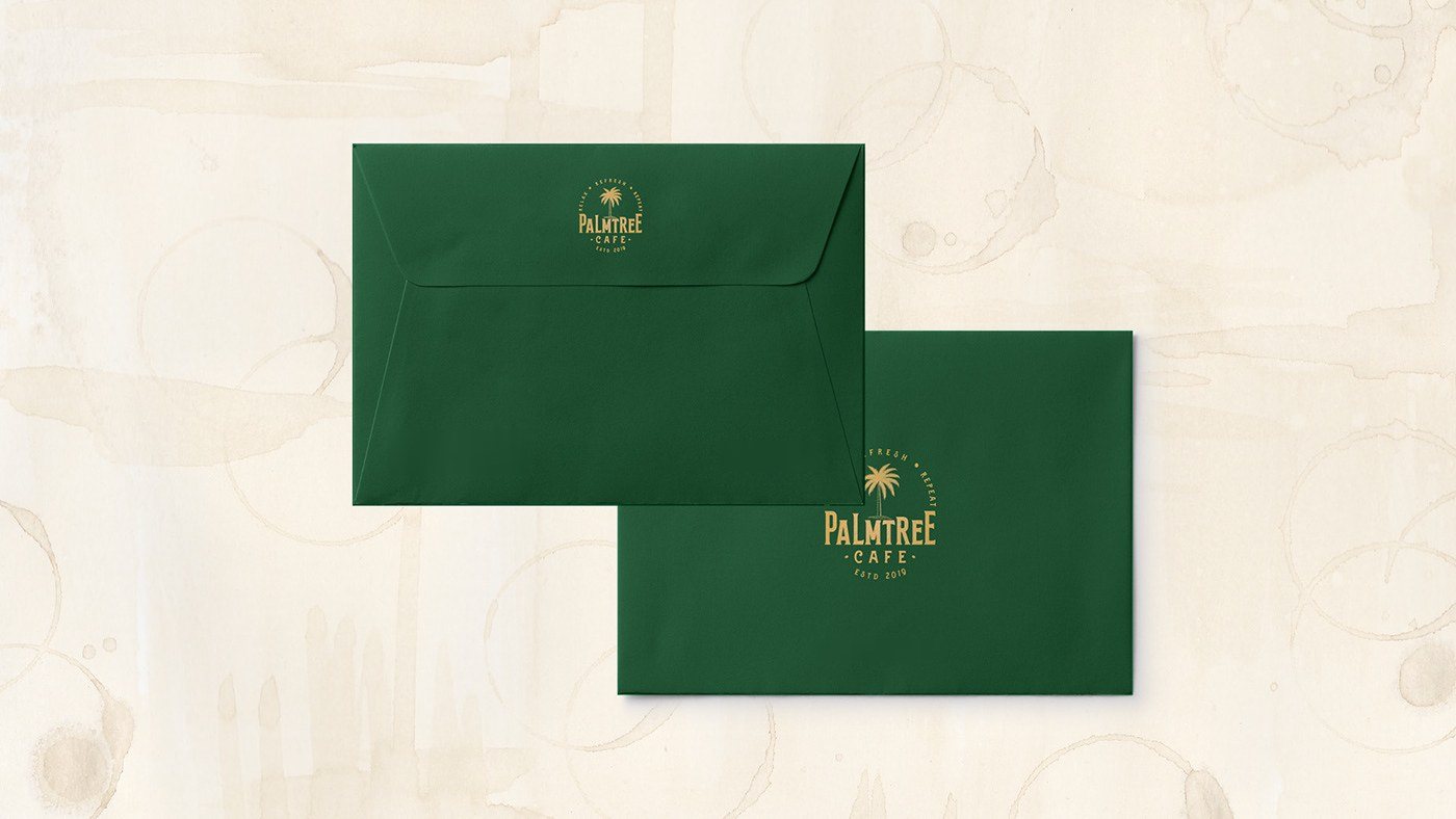
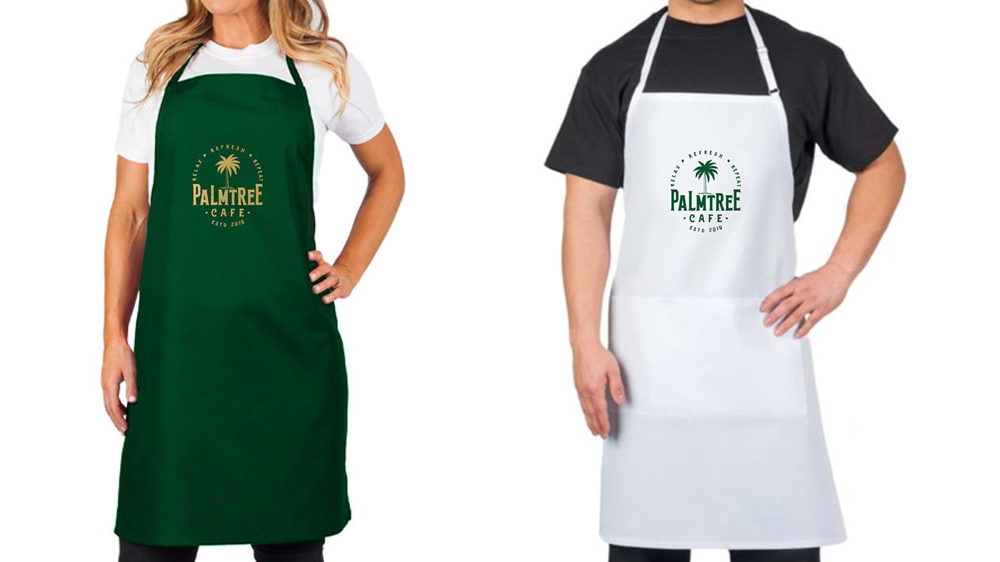
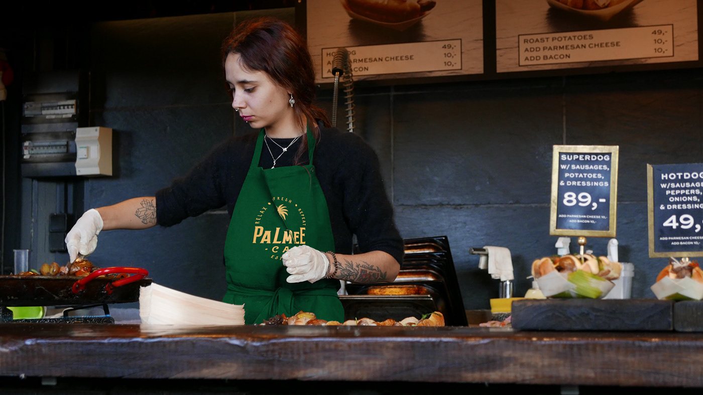
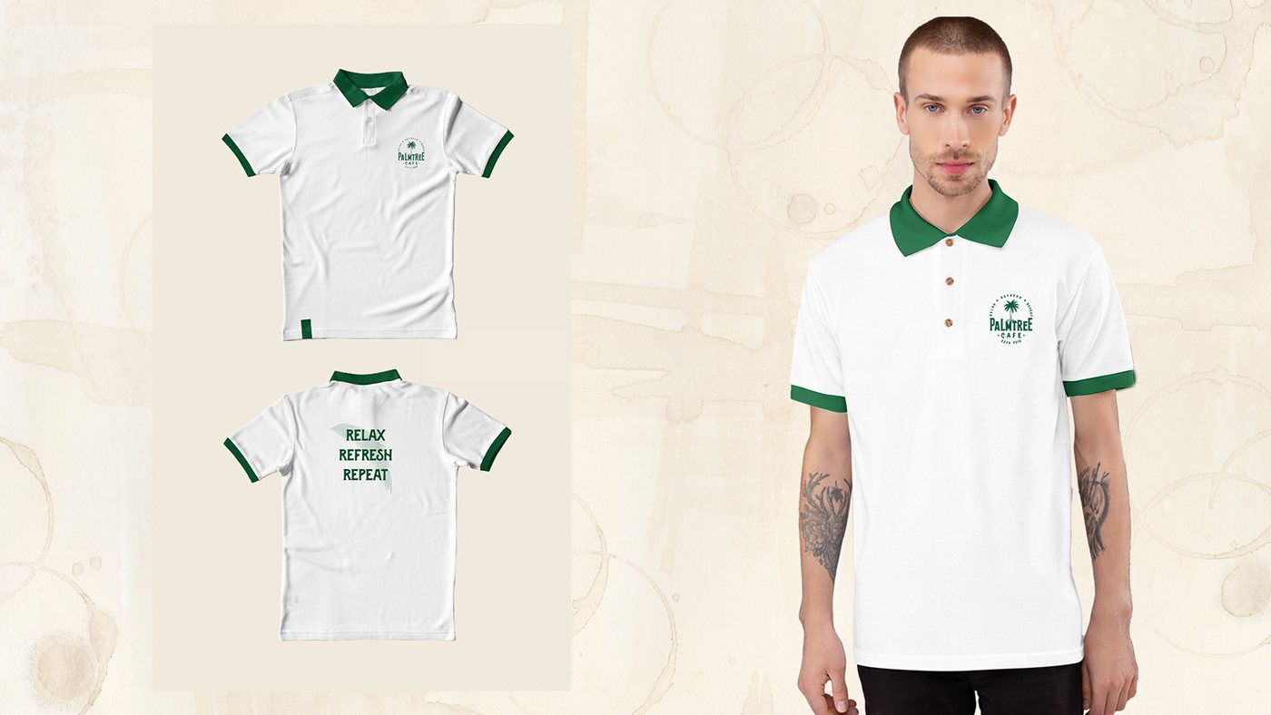
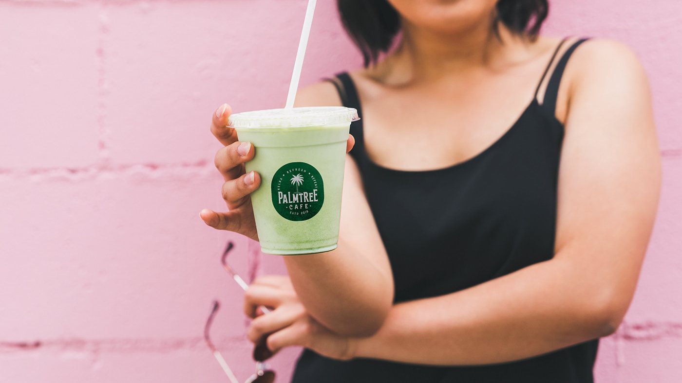
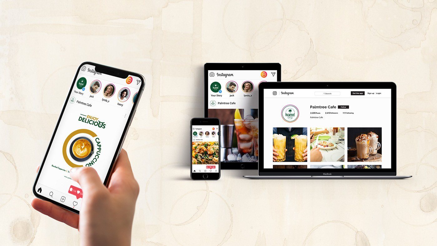
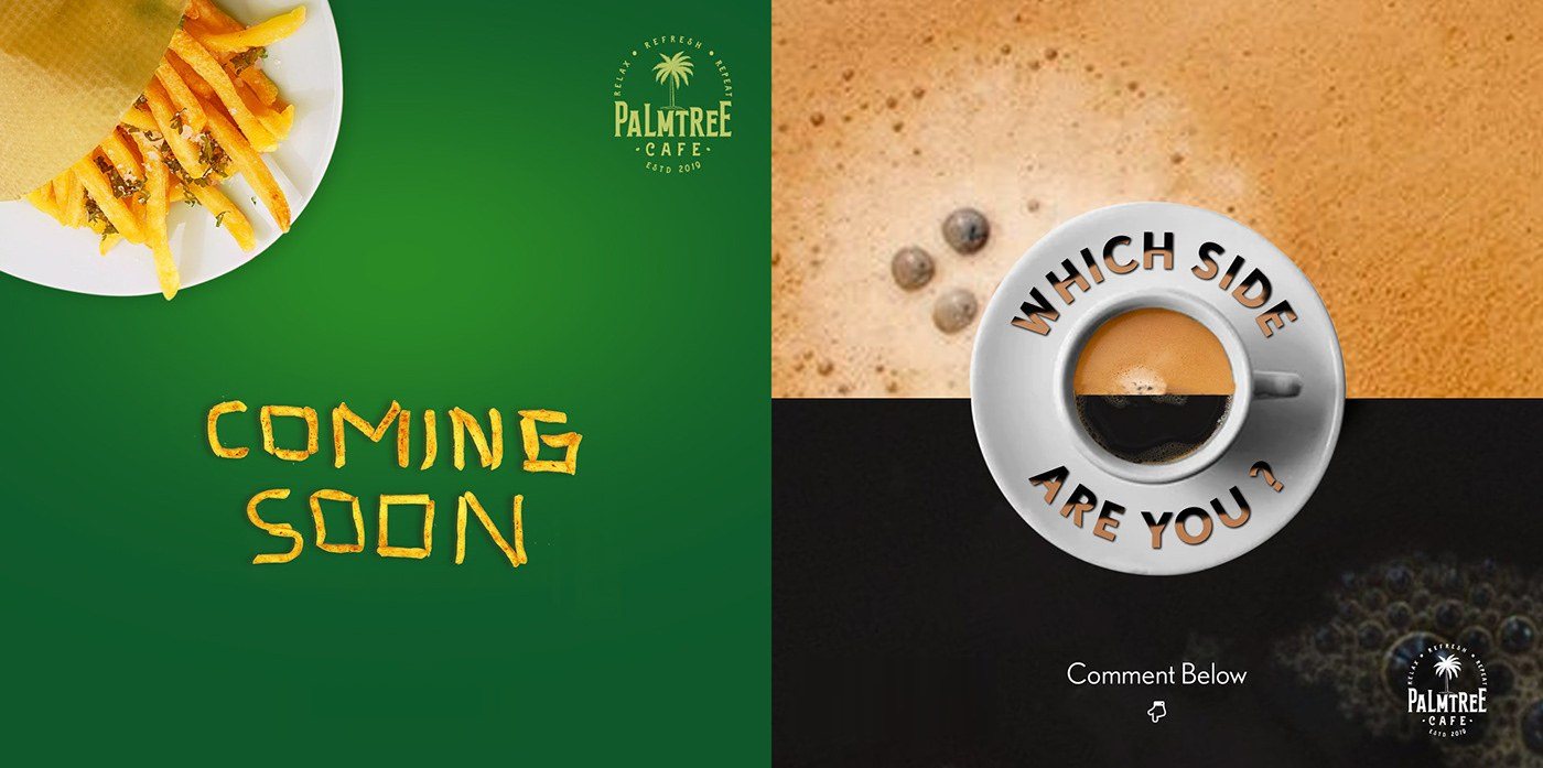
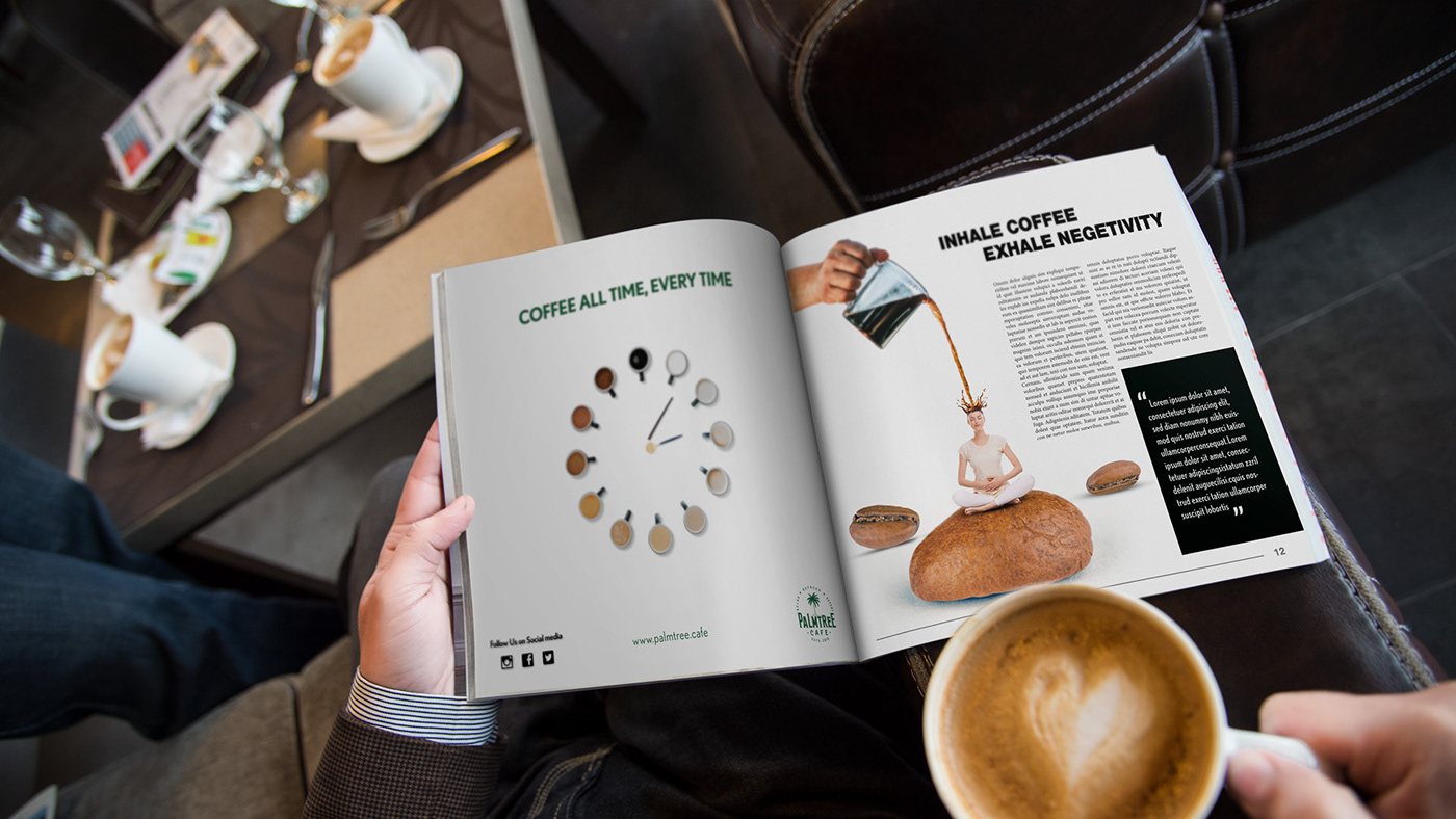
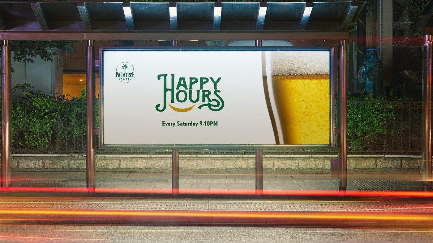
Cups in every brand colour, aprons and polos for the team, stationery, social posts and a launch campaign around town.
04 · Environmental design
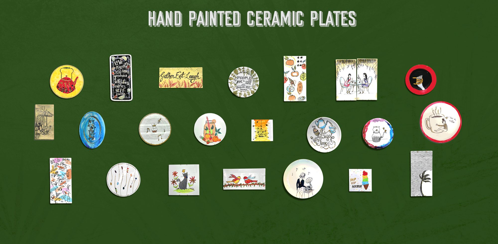
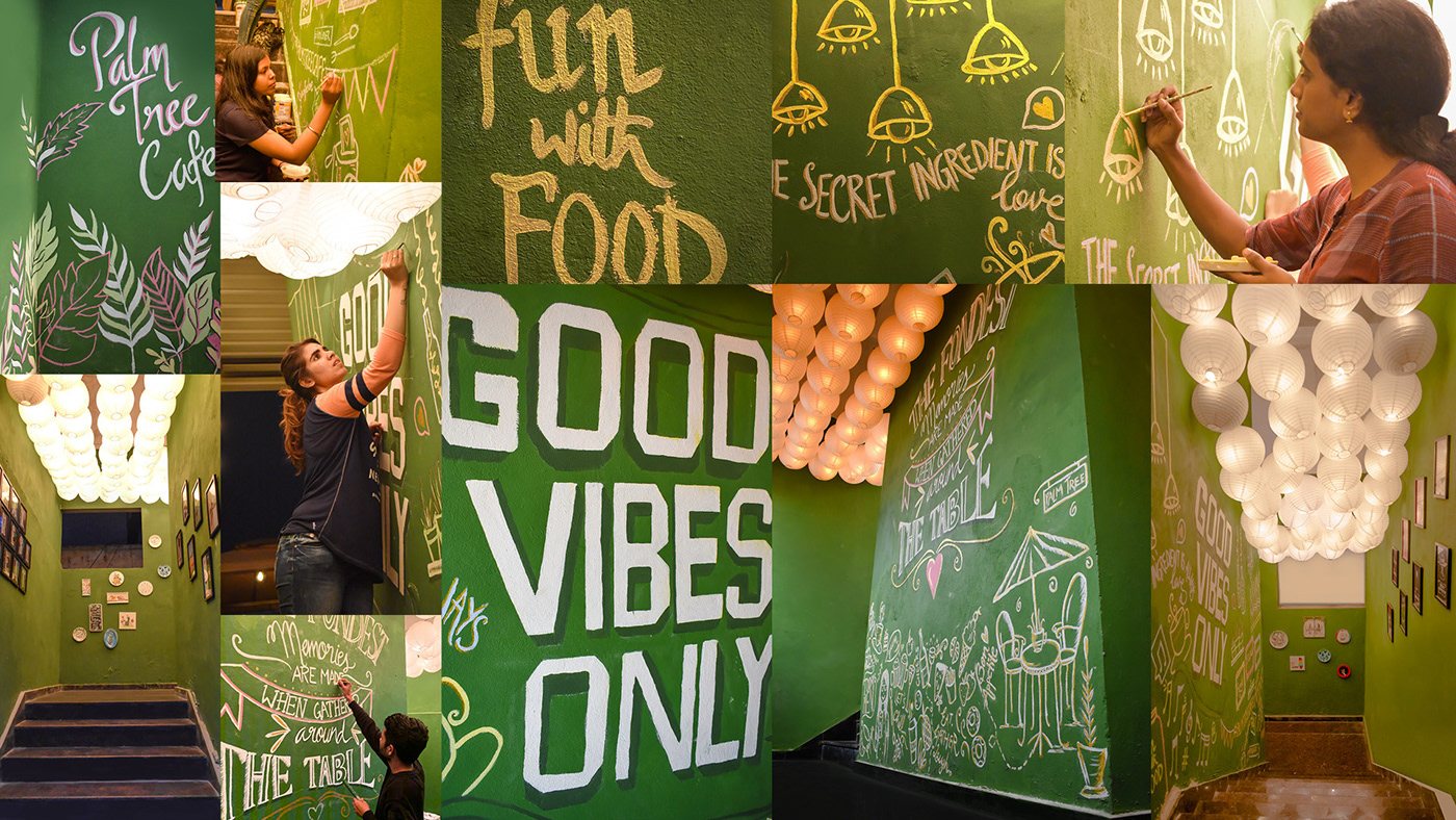
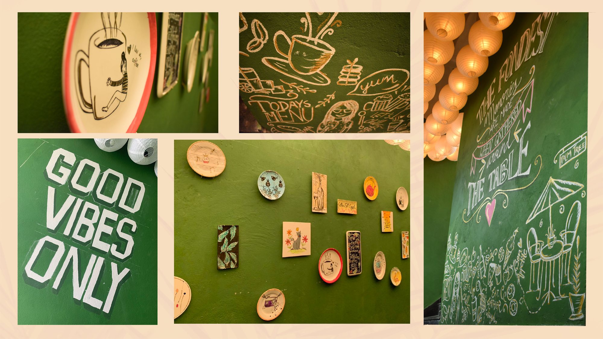
We made over the whole route, from the staircase to the rooftop, with wall illustrations, art, photo frames and hand-painted ceramic plates. Scroll to make the climb.
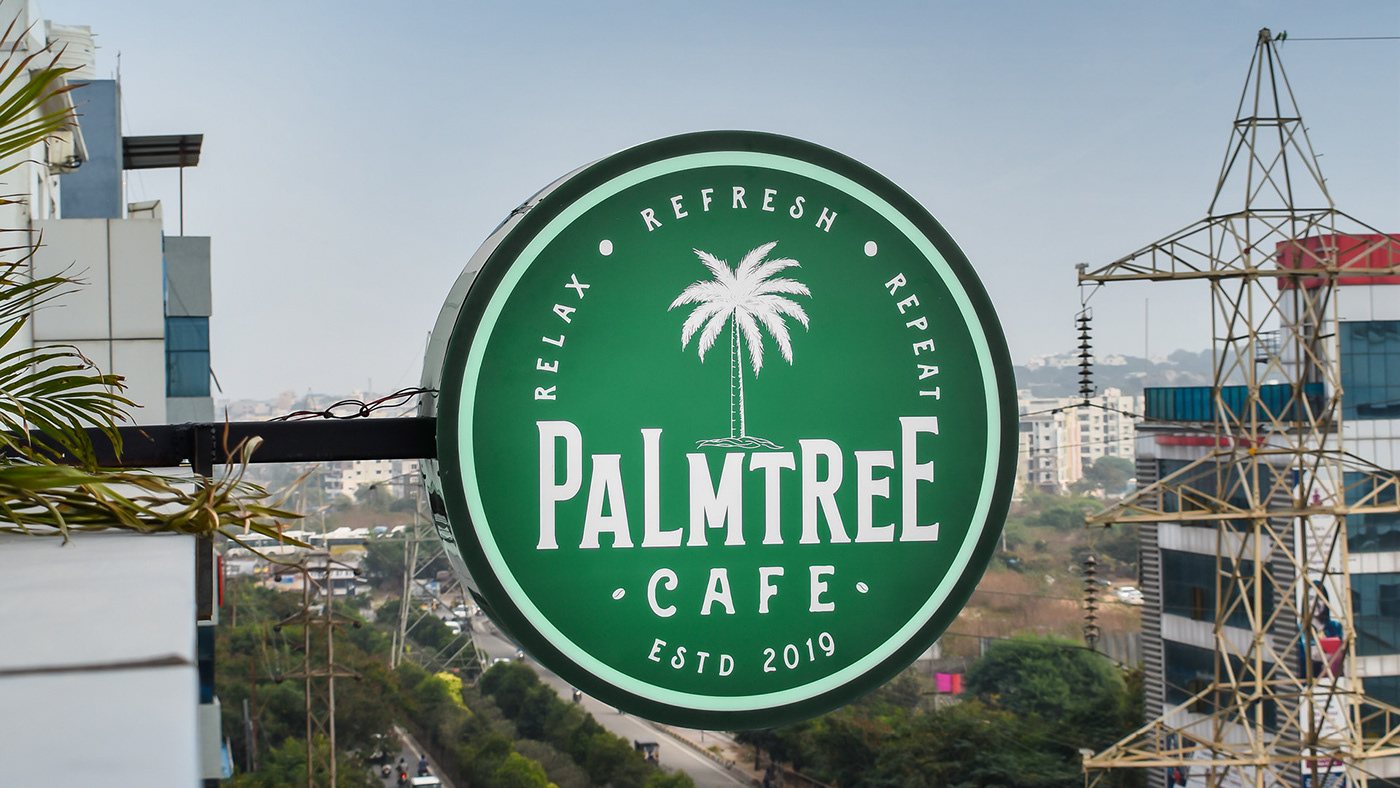
A lit seal on the facade marks the way up.
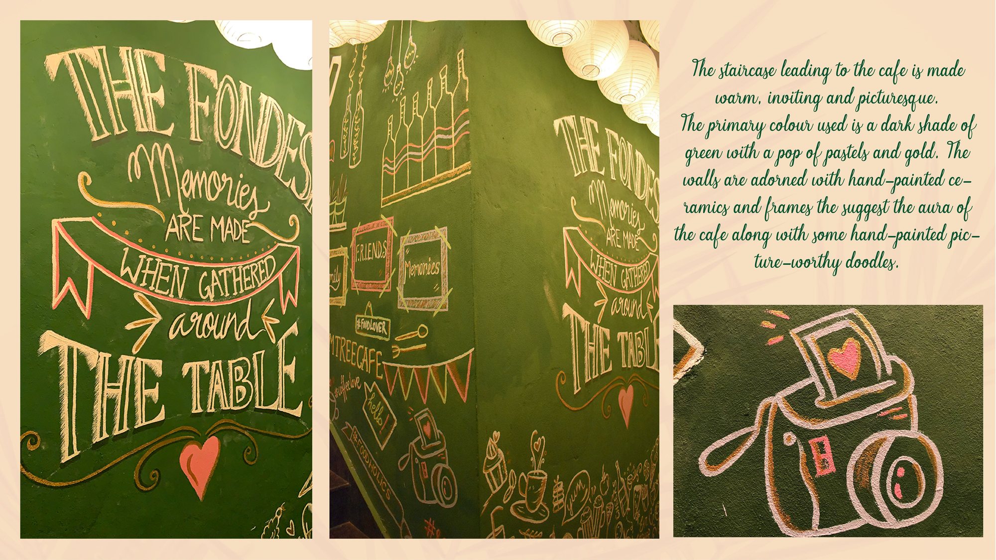
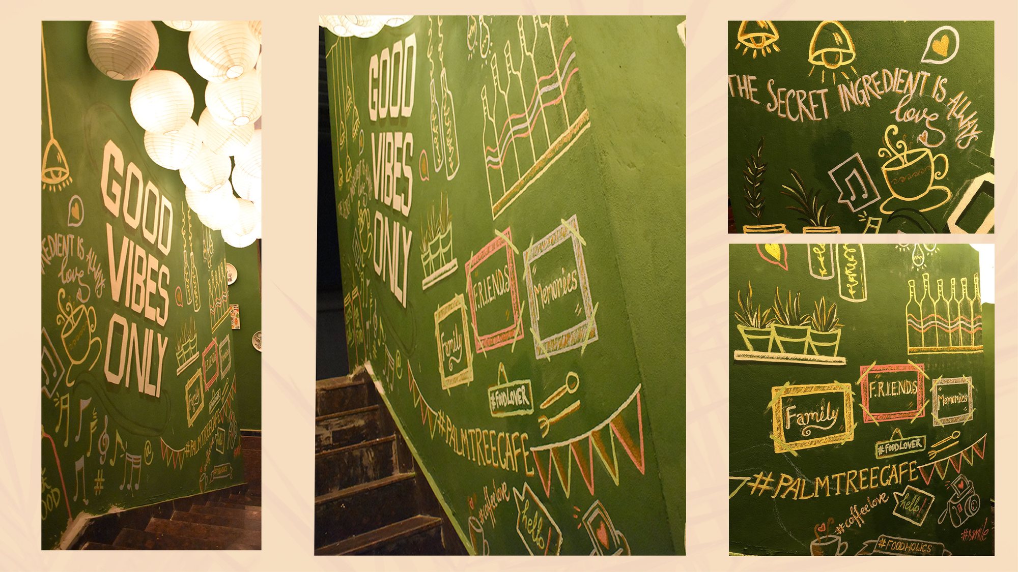
Chalk-style murals turn the climb into a story.
Hand-painted ceramics and frames on every landing.
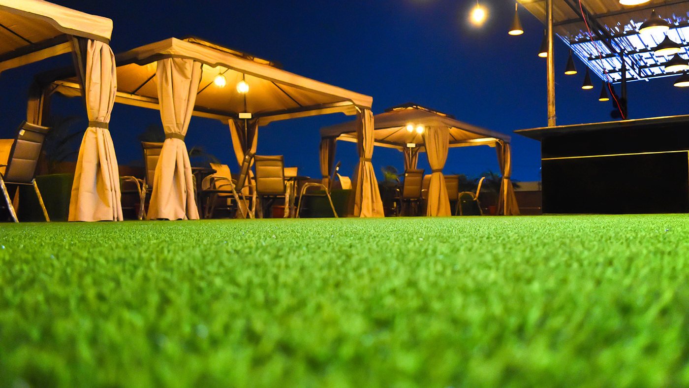
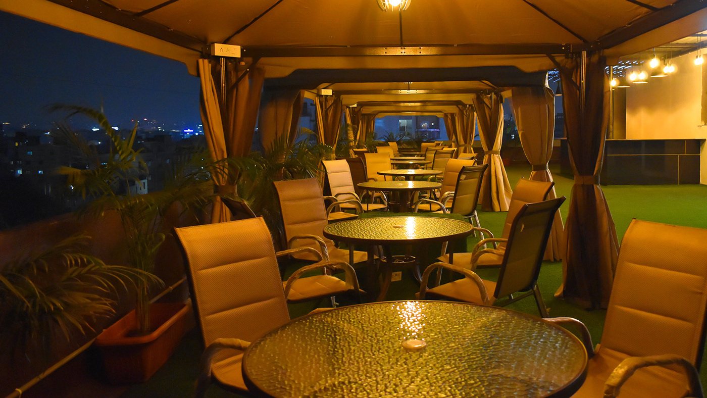
Grass underfoot, cabanas and string lights overhead.
Mood & palette
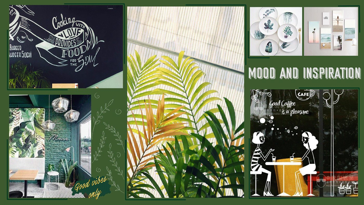
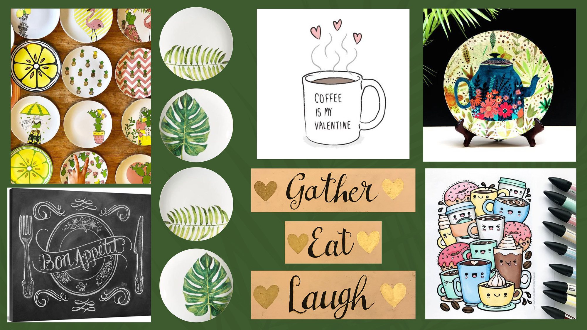
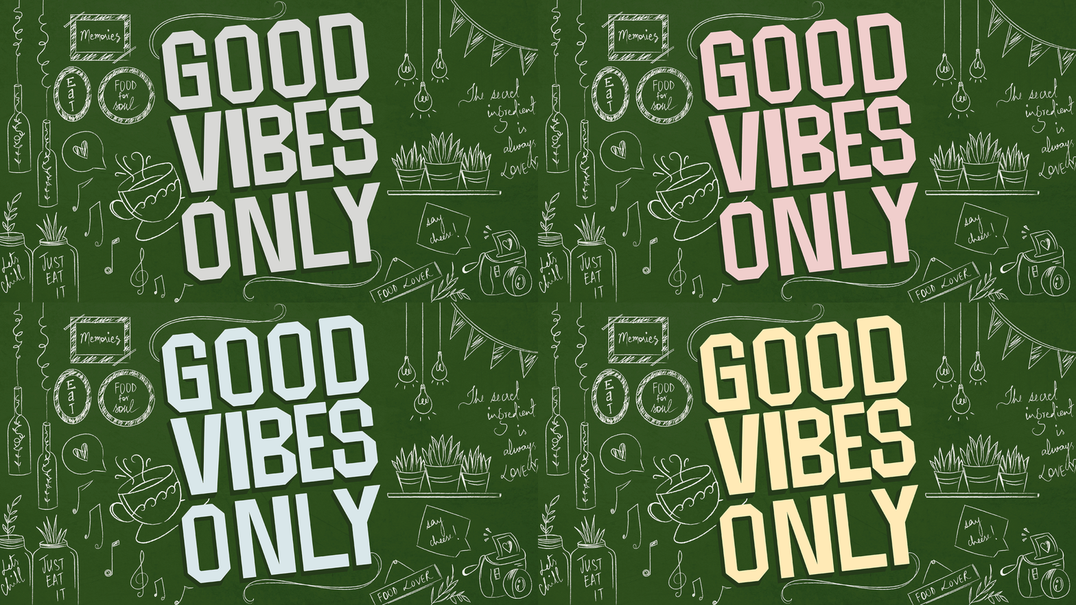
The walls go deep green so chalk-white doodles glow. Pastels and gold come in through the ceramics and frames.
Sketch to wall
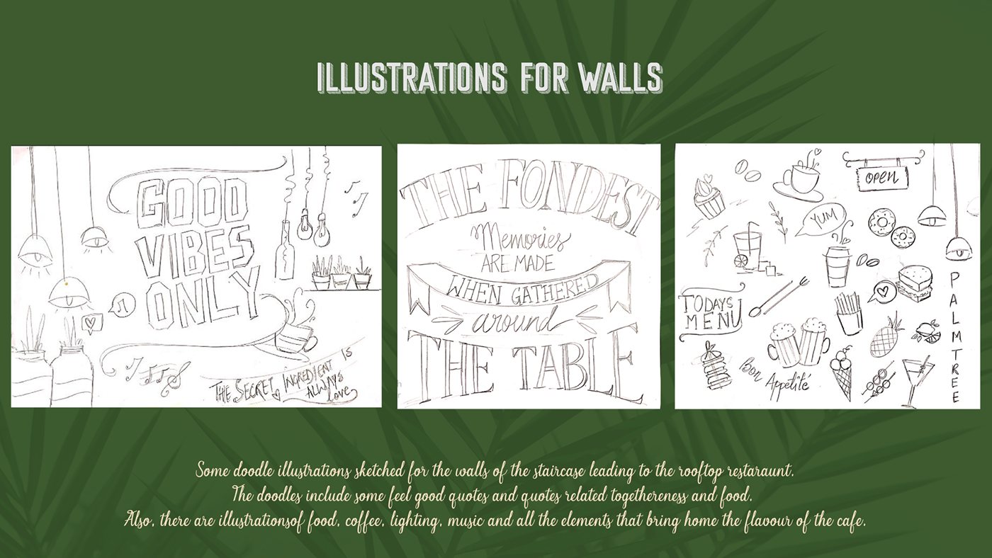
Every wall started as a pencil doodle: food, coffee, lights, music and quotes about togetherness. Then our team painted them up the stairwell, one flight at a time.
Brand & space book
Logo, colour, type, pattern and icons, then the mood, sketches and paints for the walls. Drag or click to turn pages, or use the ← → keys.
The outcome
Palm Tree Cafe opened with one clear promise, a seal people remember and a staircase they now photograph. The escape starts on the first step, not the last.