Resqpol
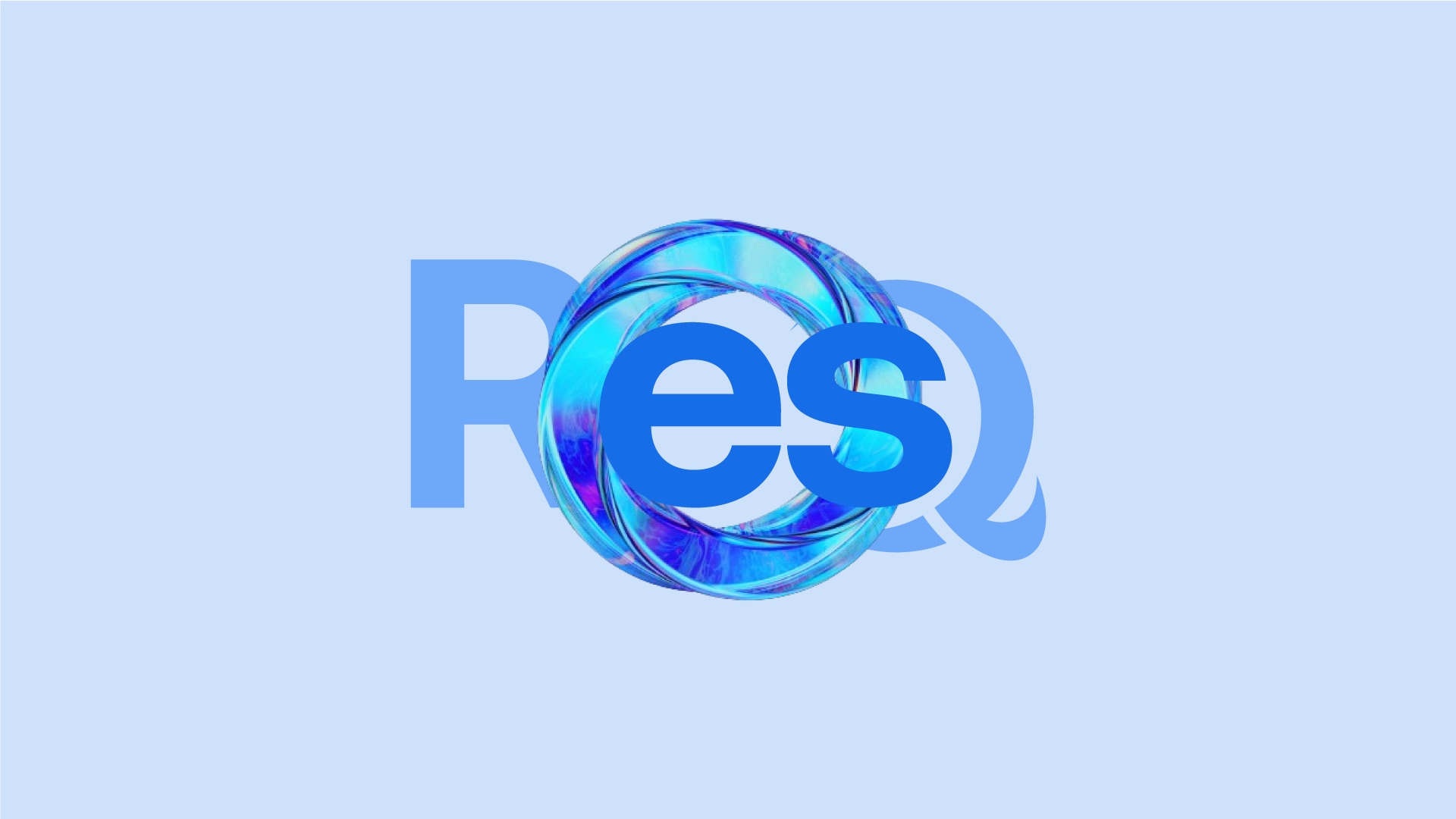
A brand for ResQ, a maker of bio-compostable alternatives to plastic - built to sound like a rescue, not a recycling bin.
The brief
Stand apart in a sea of green.
Resqpol researches and manufactures bio-compostable alternatives to plastic, with one goal: to take plastic-made products off this earth.
Most sustainability brands look alike - leaves, kraft paper, soft greens. ResQ needed a unique position against its competitors: a brand with the urgency of the problem it is solving, built on sustainability and expertise.
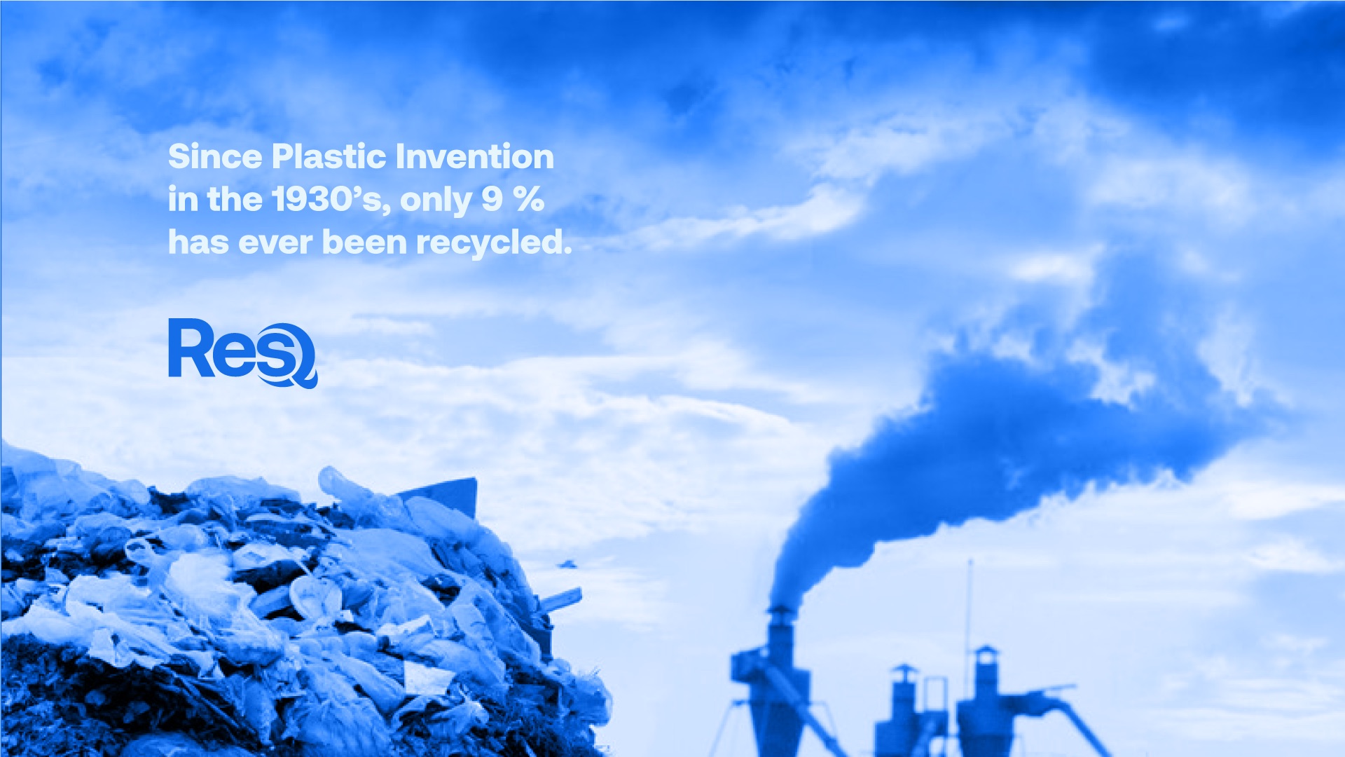
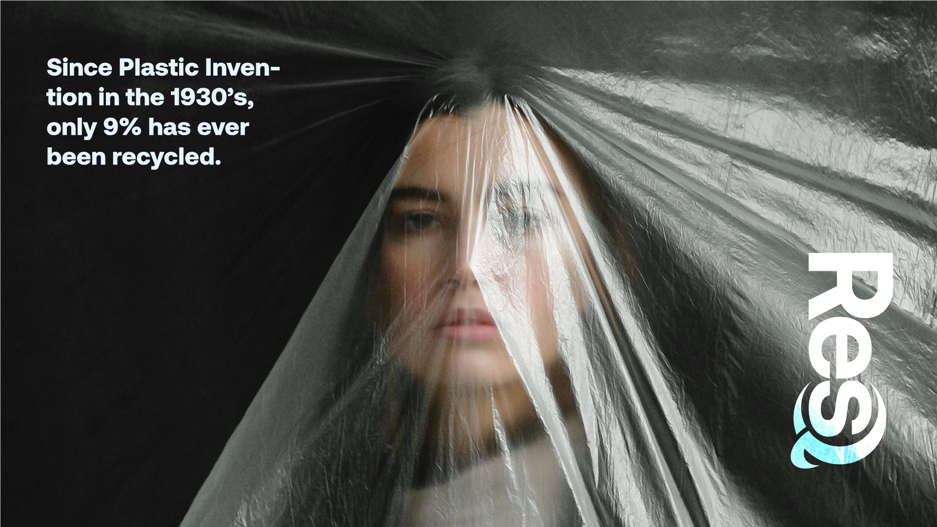
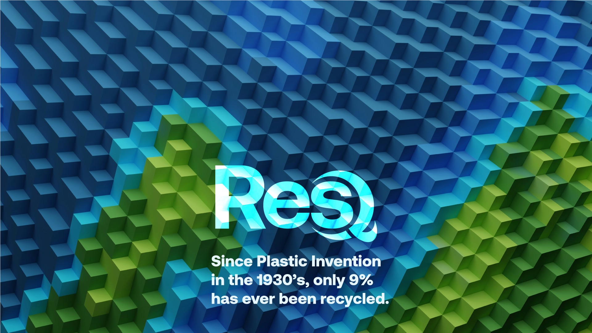
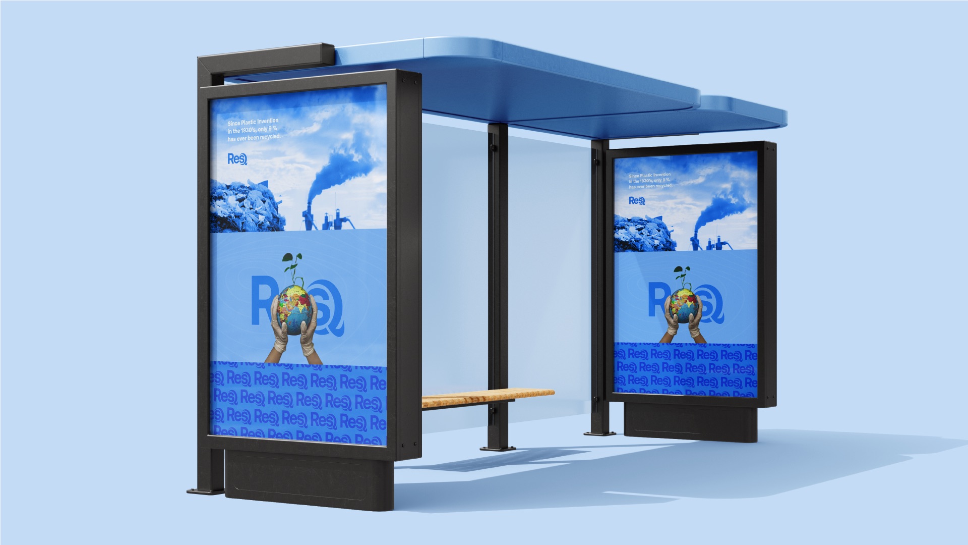
Since plastic was invented in the 1930s, only 9% of it has ever been recycled.
So we shortened the name to ResQ, gave it the colour of the ocean it is protecting, and wrote a campaign that says the uncomfortable thing out loud.
01 · The mark
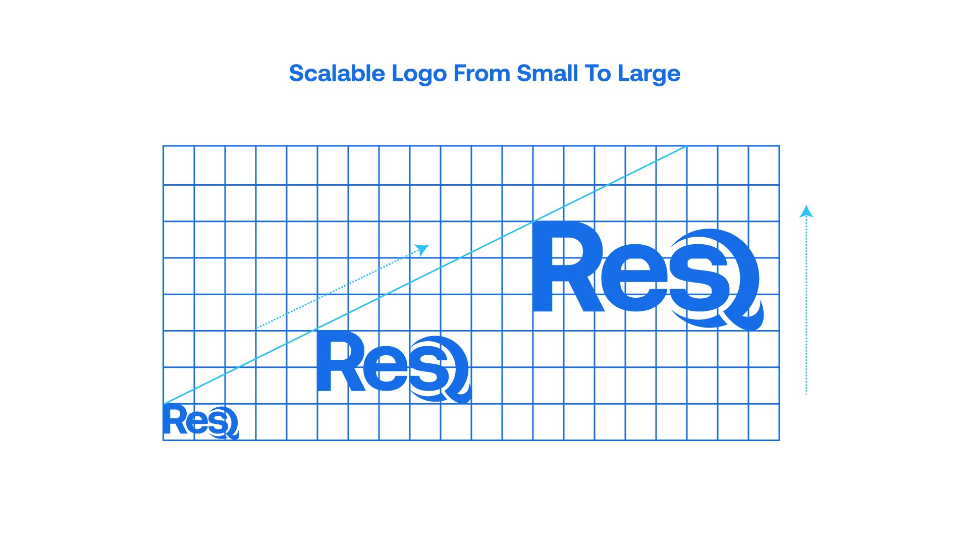
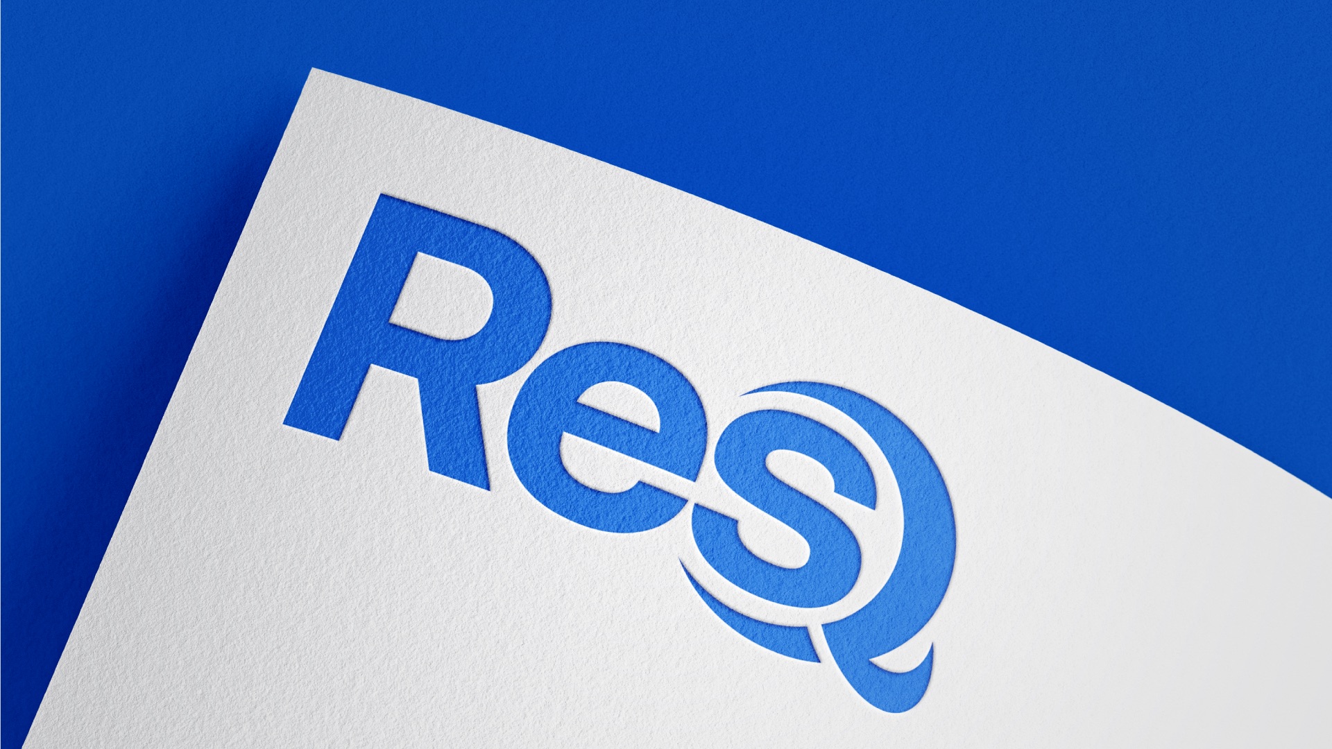
Res + Q. A rescue, spelled out.
- Built on a gridCap height, x-height and baseline lock the letters together.
- Heavy, friendly lettersA bold grotesk keeps the word readable from a bus stop to a wristband.
- The Q is the heroTwo arcs wrap the s like a life ring - or a wave breaking around it.
02 · Identity system
One blue, many depths.
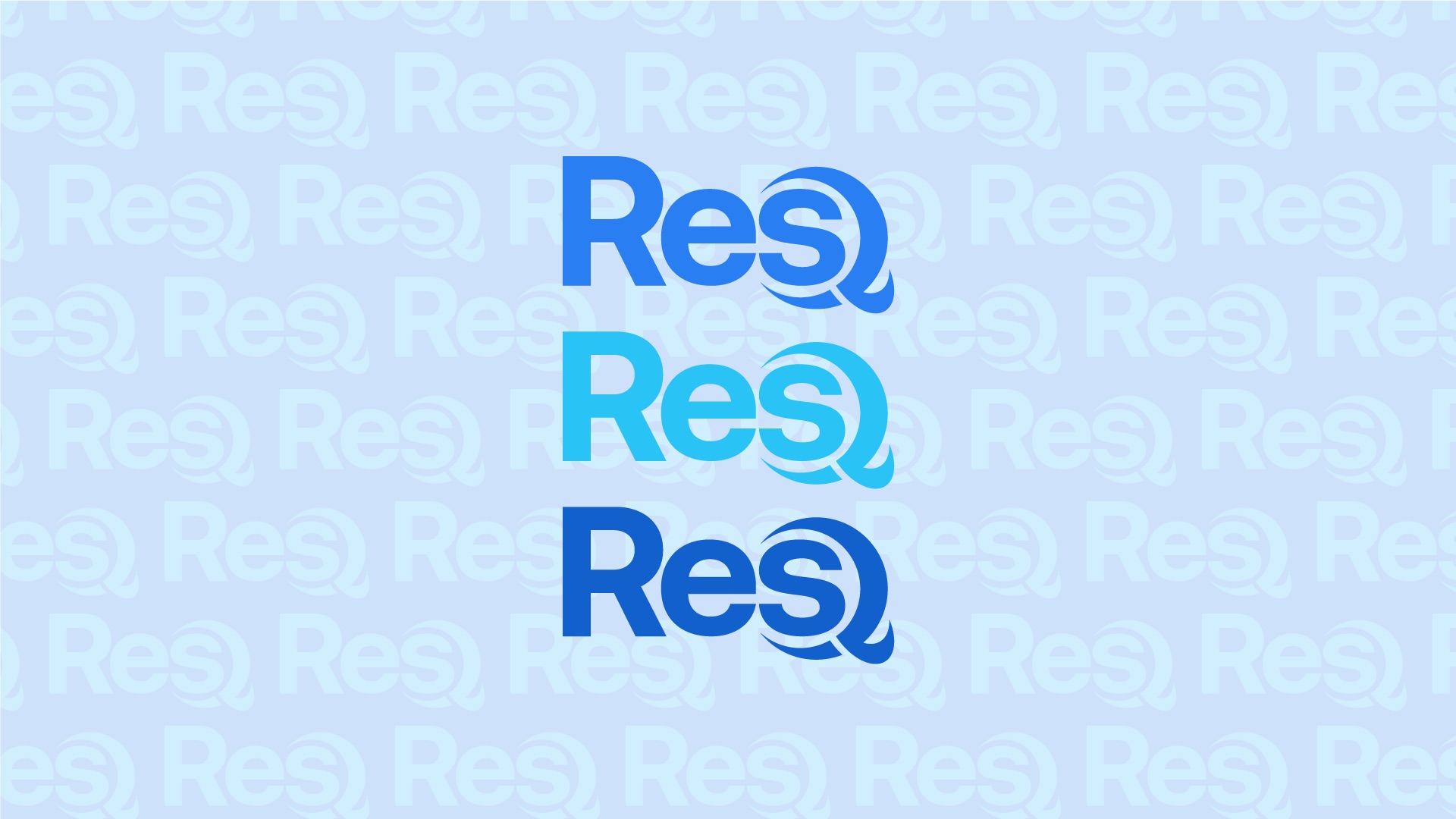
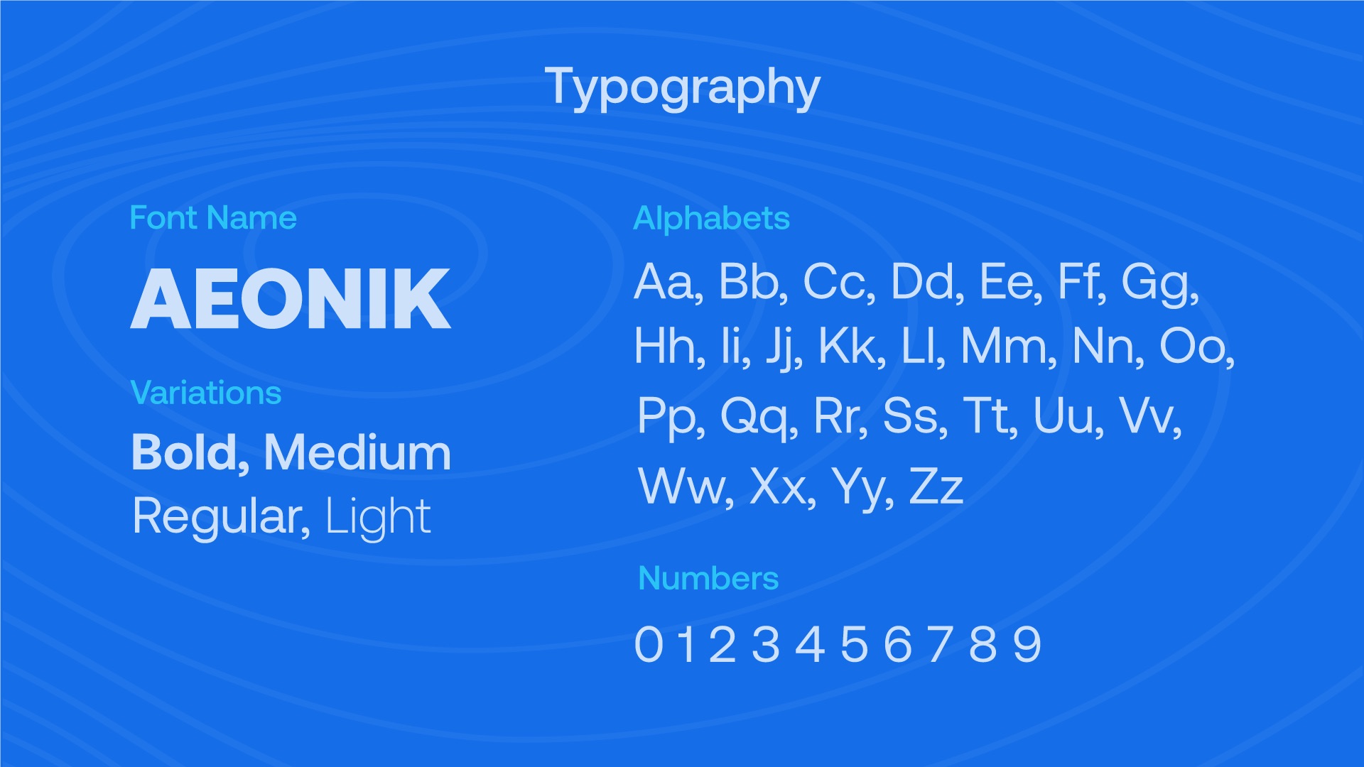
A single primary blue carries the brand, with tints for calm surfaces and four supporting shades of water for campaigns. Aeonik sets everything, from headlines to numbers.
Pattern
The name becomes the texture.
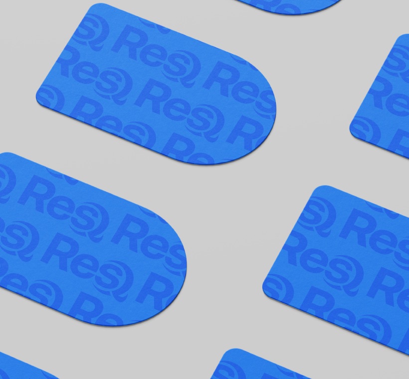
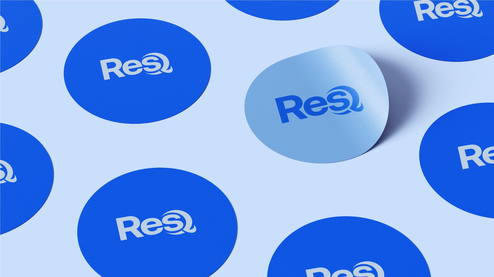
Repeated wordmarks in tonal blue wrap cards, stickers and shelters - scroll and the rows drift like currents.
03 · Campaign
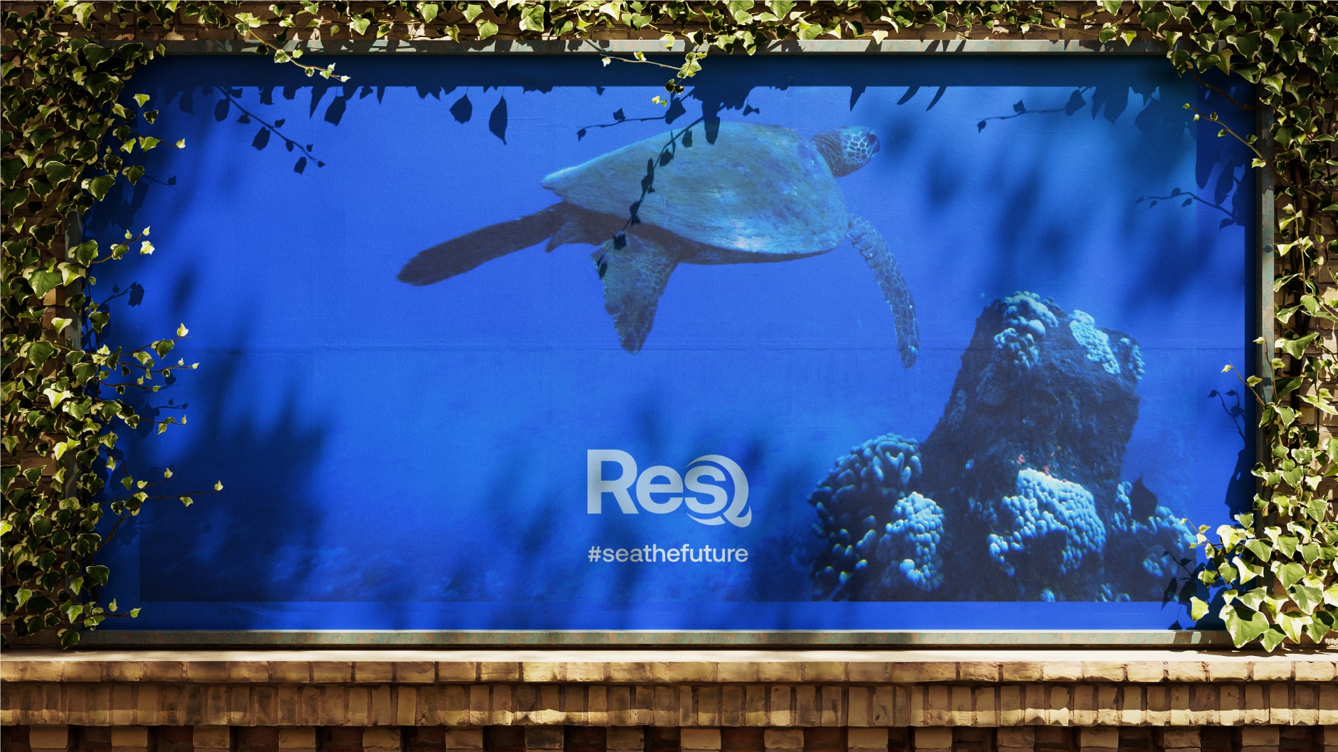
#seathefuture
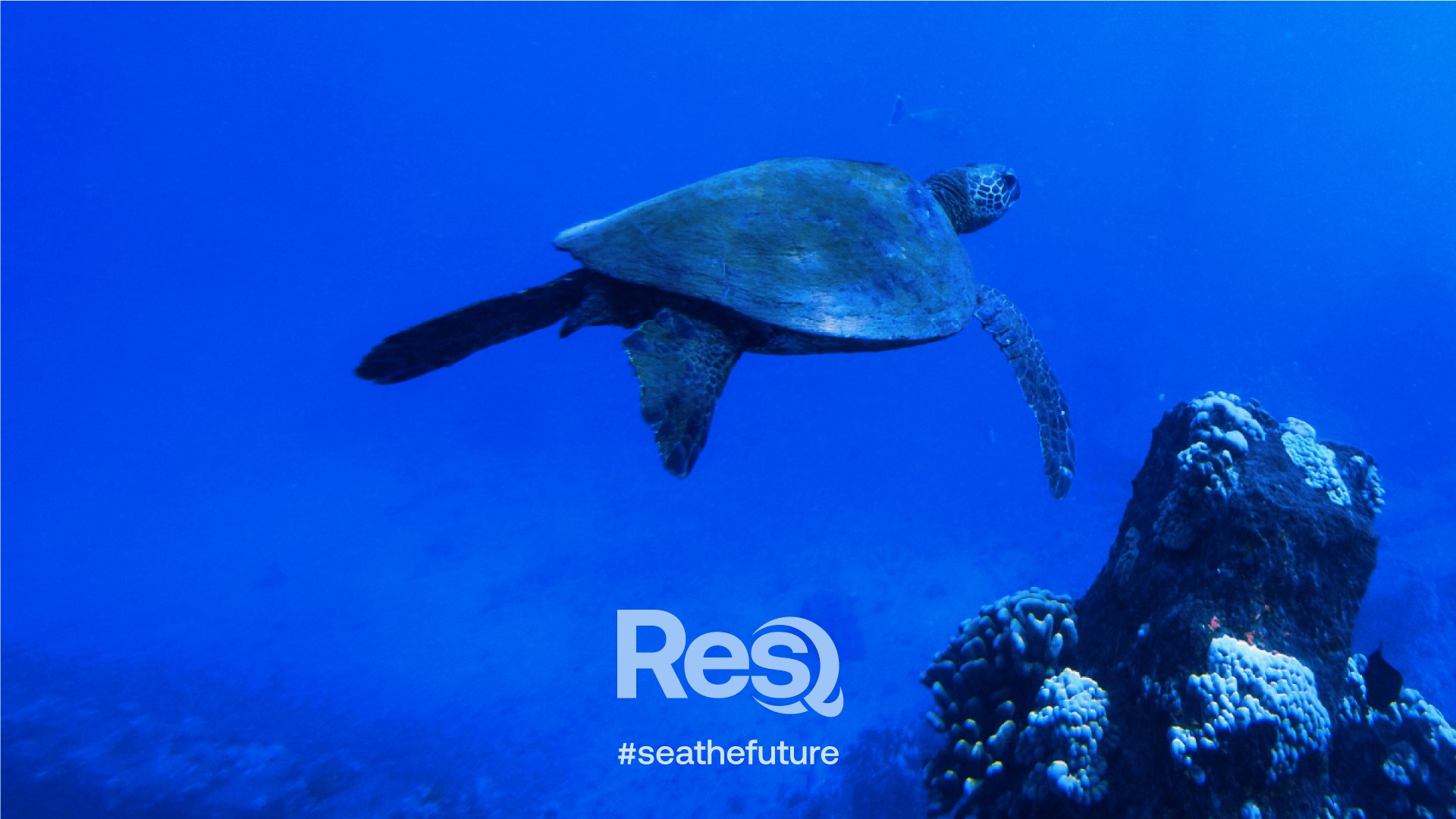
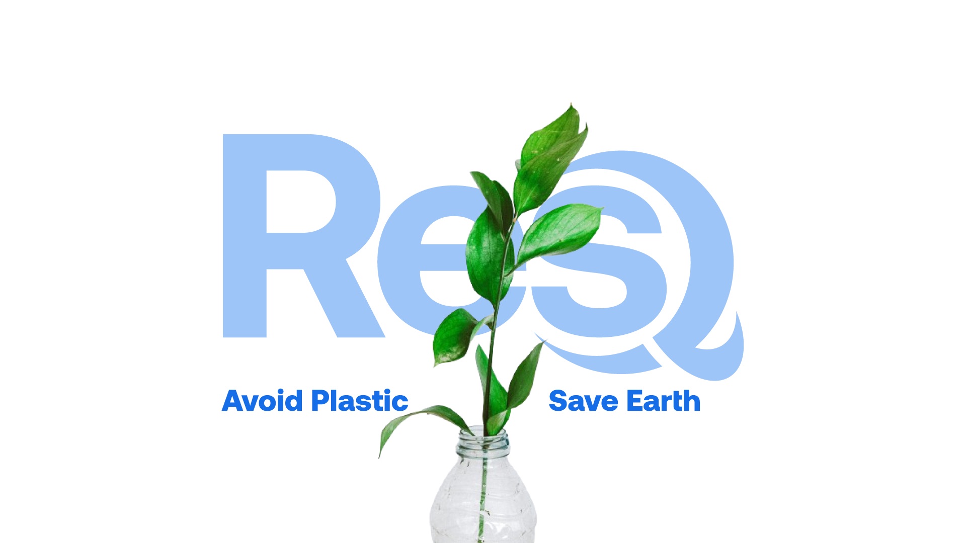
One fact, told many ways: under the sea, in smog, in a pair of gloved hands, and wrapped tight around a face.
0%
of all plastic made since the 1930s has ever been recycled. Each dot is 1% - watch how few turn blue.
- Recycled
- Landfill, burnt or in the ocean

04 · Applications
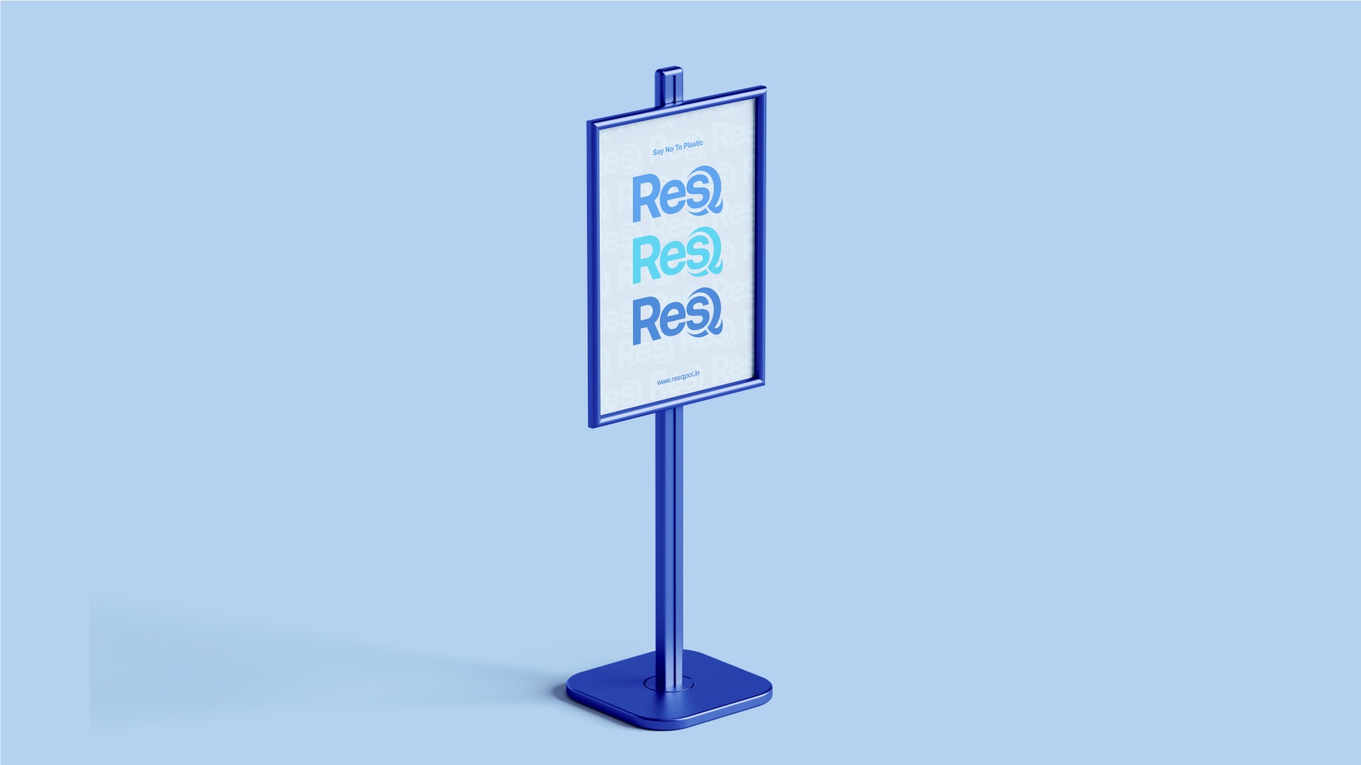
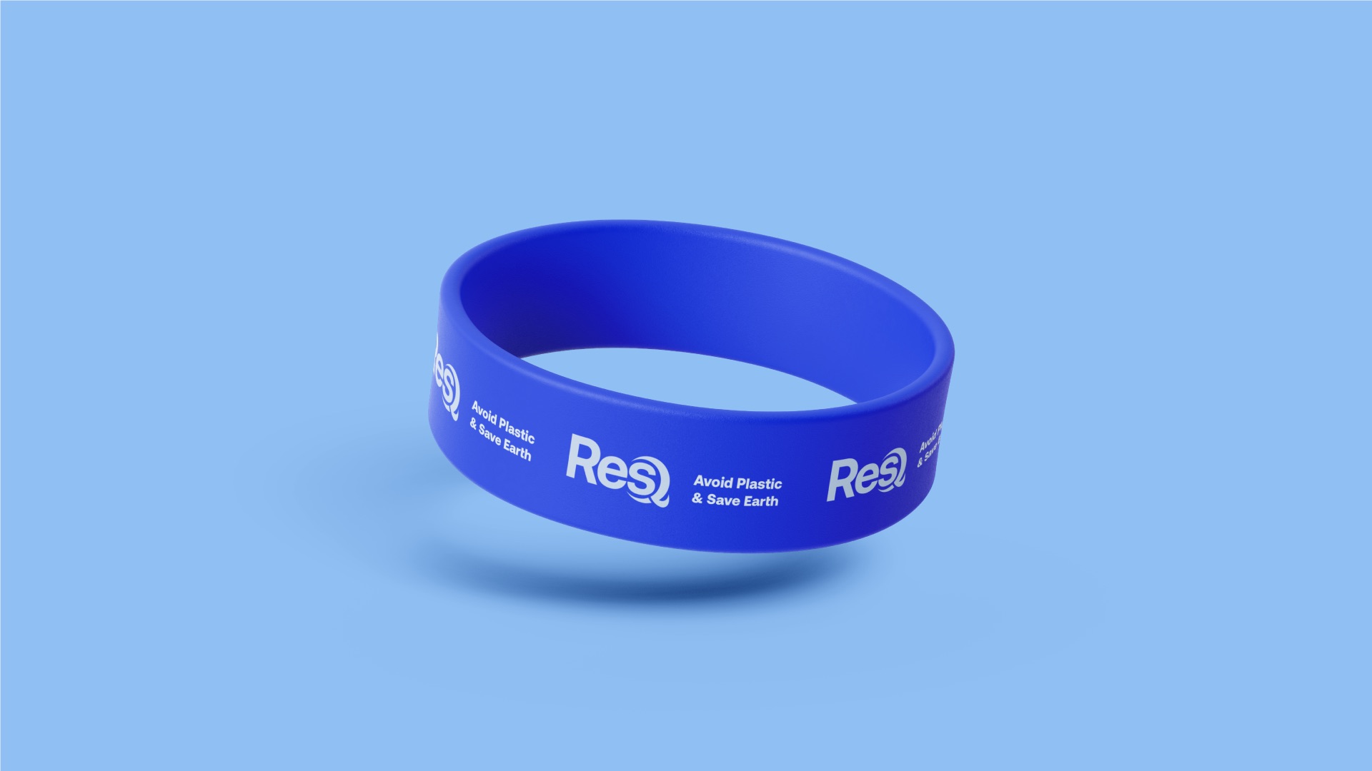
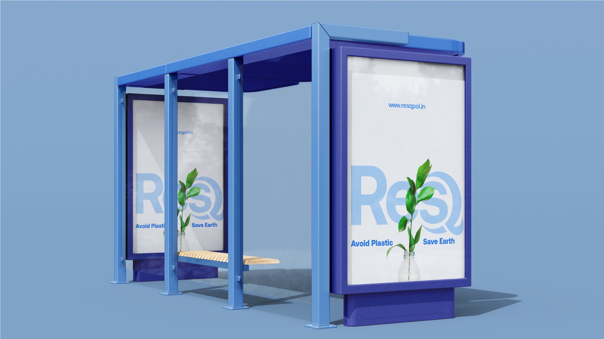
From a business card to a bus shelter.
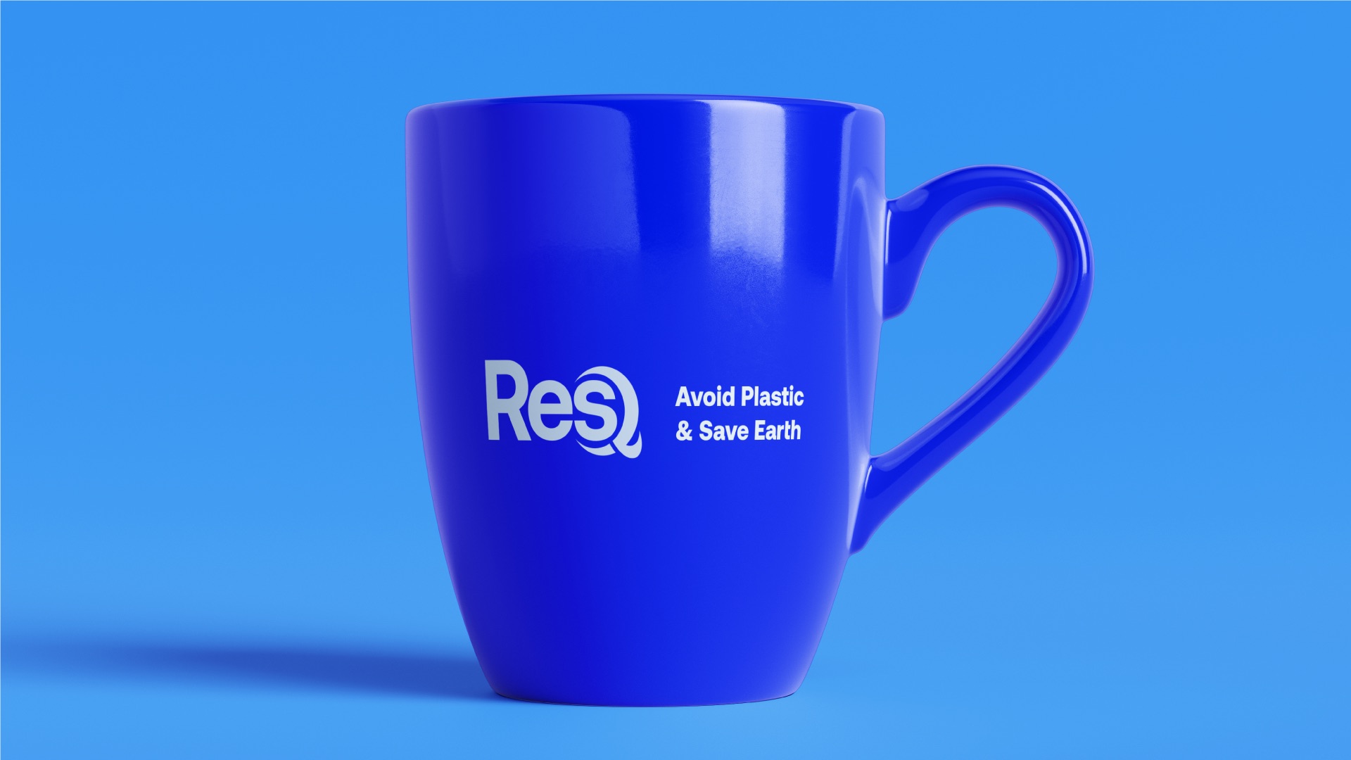
Stationery, merchandise and outdoor - the blue and the pattern make every piece recognisable at a glance.
Business card · hover or tap to turn
Brand presentation
The whole system, page by page.
Logo, colour, type, pattern, campaign and applications. Drag or click to turn pages, or use the ← → keys.
The outcome
Sustainability that sounds urgent.
ResQ now looks nothing like the leafy brands around it - an ocean-blue identity with a name people remember and a campaign line they repeat.
- Wordmark, construction and colourways
- Colour palette, Aeonik type system and pattern
- #seathefuture campaign visuals
- Stationery, merchandise and outdoor mockups