Positioning
A partner that upgrades materials
Not a commodity supplier selling by the kilo, but a specialist that solves a processing or performance problem.
Brand strategy and identity for a Hyderabad maker of next-gen polymer modifiers. Small additions, big performance.
The brief
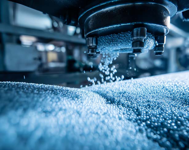
Nexapol makes the additives, masterbatches and compounds that help plastics perform - tougher shoe soles, scratch-free car interiors, easy-peel food lids and better recycled material.
Its products disappear inside other people’s products. Buyers are engineers and procurement teams at international brands, spread across eight very different industries, and they need to trust a supplier long before they ever see a pellet.
Nexapol needed a brand that feels engineered and dependable, warm enough to stand out from commodity suppliers, and simple enough to explain one company across recycling, footwear, cables and cars.
Shaping the future with next-gen performance polymers.
01 · Brand strategy
A few percent of the right additive changes how a whole material behaves. We built the brand on that idea: Nexapol is the small, smart addition that makes everything around it perform better.
The name
NEXAnext generationPOLpolymerthe promise is in the name
Positioning
Not a commodity supplier selling by the kilo, but a specialist that solves a processing or performance problem.
Promise
Every product makes something last longer, look better or process faster. The line leads every piece of communication.
Personality
A precise geometric wordmark, a warm serif voice and heat-of-the-extruder colours. Technical, never cold.
Speciality products
Patents
Export countries
Industries served
02 · Brand identity
Two interlocking halves: a base polymer and the modifier that upgrades it, locked into one form.
Built on three ellipses, the mark reads as pellets, as a chain link and, in the space between the halves, as an N. Orange is the material; rust is what Nexapol adds. Scroll to lock them together.
A custom geometric wordmark whose letters link the way molecules bond - and the O carries a rust pellet from the mark.
Identity system
Orange and rust come from the glow of a running extruder and run together as one gradient. Cream keeps pages light and human; carbon handles the technical detail.
Headlines · Crimson Pro
Aa
Elevating performance with Nex-Gen polymer modifiers
Text & data · Geologica
Aa
Anti-scratch silicone masterbatch for PP interiors
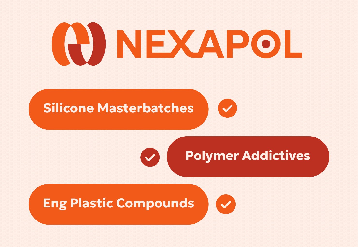
Silicone Masterbatches
Polymer Additives
Engineering Compounds
Product pills03 · Market architecture
We organised the whole offer by the industry it serves, so a footwear buyer and a cable engineer each find their own problem first. Each market got its own outline icon.

Value addition during recycling decides the quality of the recycled material.

Light, resilient EVA soles that resist abrasion - used by international brands in India.
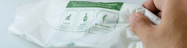
The single-use plastics ban grew bio plastics fast, and with them new processing limits.

Scratch-resistant PP interiors and engineering compounds for under the hood.

Food-grade easy peel for jam, butter, jelly and yoghurt lids.
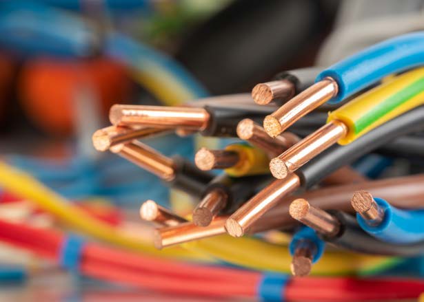
High-temperature process aids, coupling agents and stabilisers for consistent cable compounds.

Compounds developed for each customer’s application.
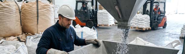
A manufacturing facility in Hyderabad with its own testing lab.
04 · Applications
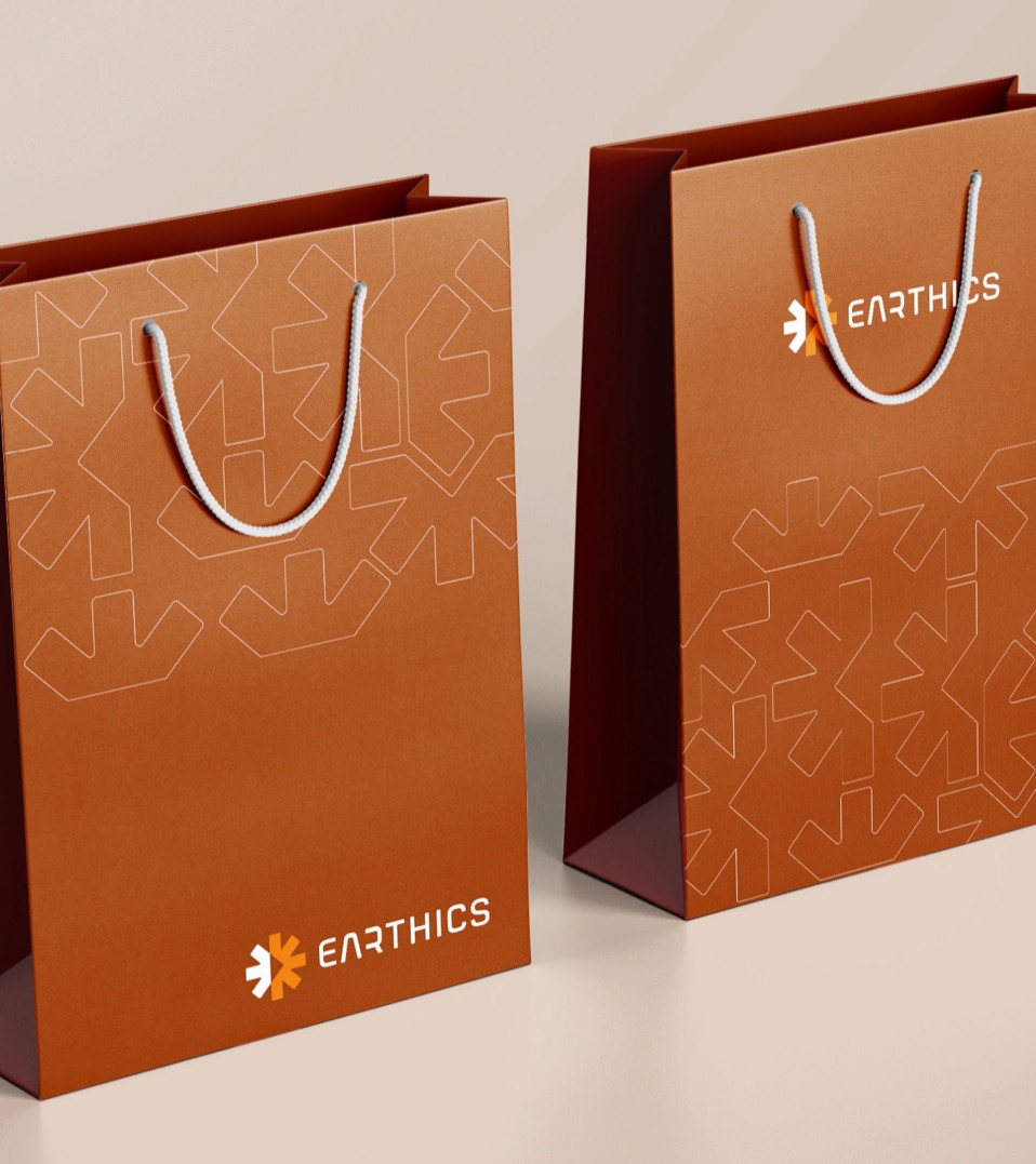
The identity had to hold up on a shipping carton and a 25 kg sack in a warehouse as well as on a business card across a meeting table.



05 · Expo stall
At the trade fair the identity became a space you walk into: a fascia you can spot across the hall, walls that tell the market story and a counter carrying the product pills.
Company brochure
Eight pages, one per market, in the brand’s colours and type. Drag or click to turn pages, or use the ← → keys.
The outcome
Nexapol now looks like what it is: a speciality partner, not a commodity supplier. One clear idea, a mark that explains it and a system that stretches from a lab sample to an eight-market brochure.